- Styleguide
Introduction
As Volusion continues to help founders grow their businesses and provide them with our ecommerce know-how, it’s important that we have content uniformity to keep our brand accessible and cohesive.
This applies to both written and design content, which is why we’ve put together this handy style guide, which has guidelines for voice and tone, brand colors, logo usage, imagery, grammar and plenty of other brand elements.
We encourage everyone representing the Volusion Brand to familiarize yourselves with this guide and use it as a reference when creating content for our site.
Frequently Asked Questions
What file type should I use for the logo?
Use the PNG files for any on screen use of the logo that are no larger than 800px wide (to avoid pixelation). For logos that will appear larger use the SVG (Scalable Vector Graphic) file type so it will be sharp and crisp at any size.
I can’t find the assets I need?
Please contact our brand represenitive Tracy Turner at tracy.turner@volusion.com with details about the images, assets or content you are needing and how it will be used.

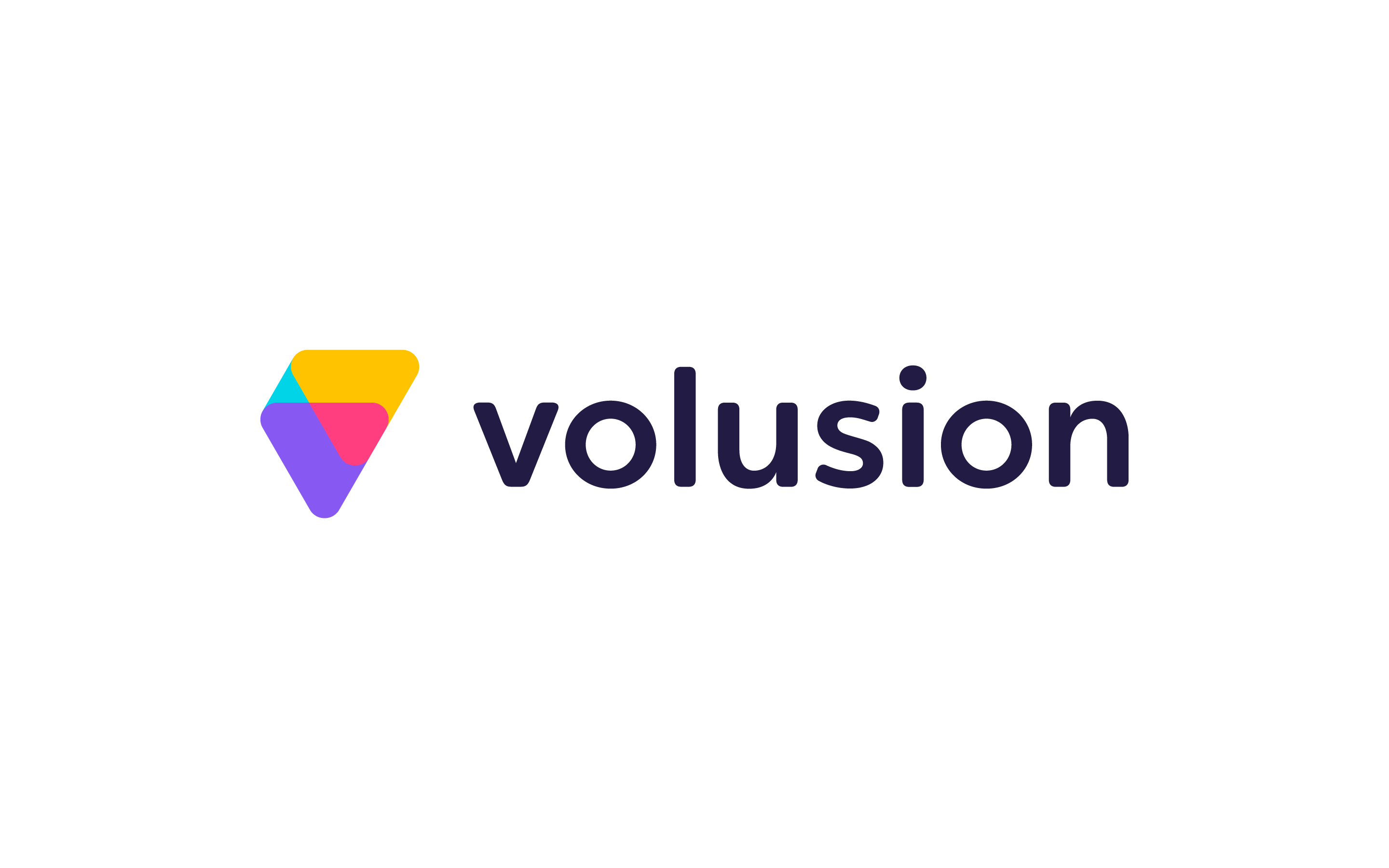
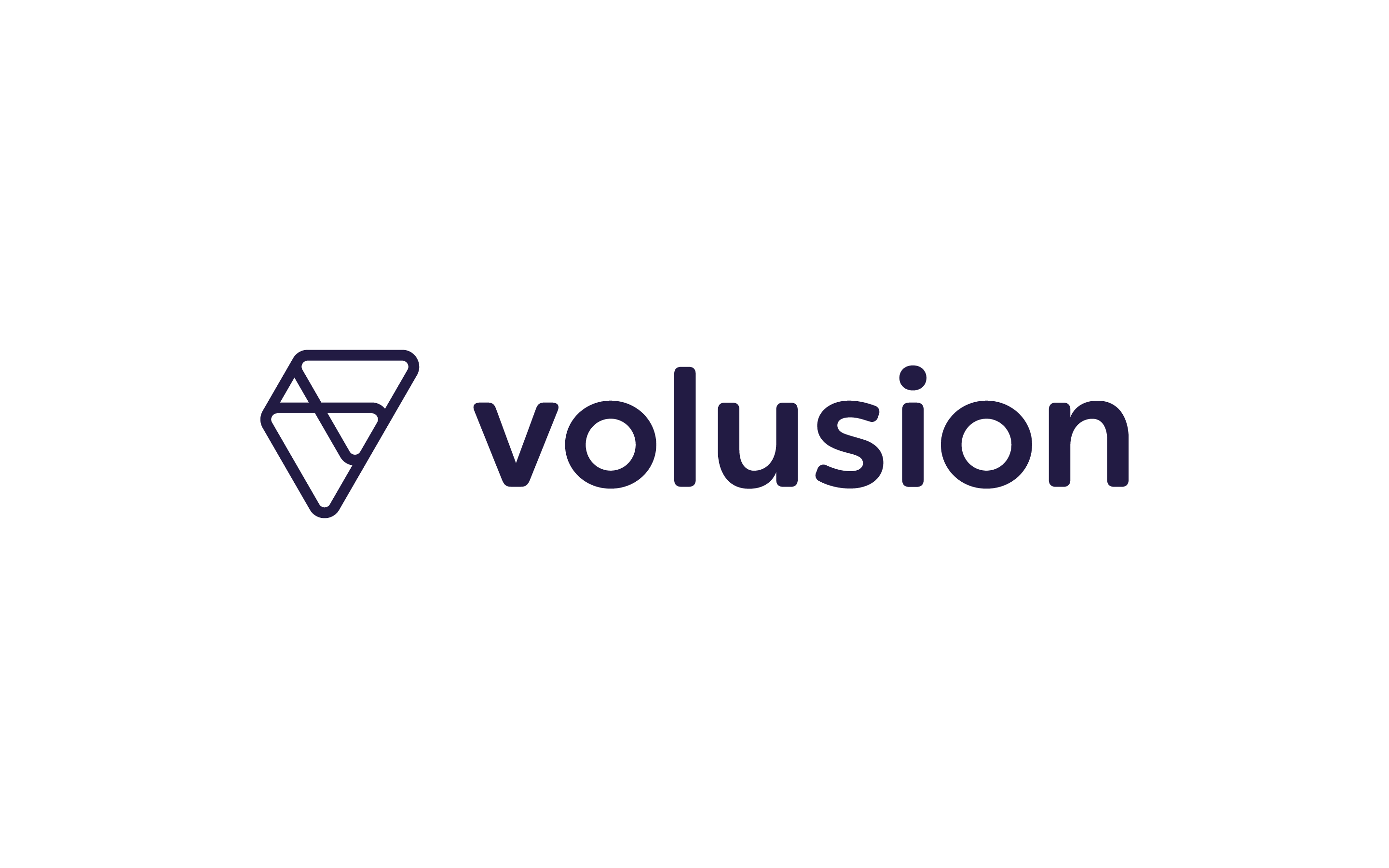
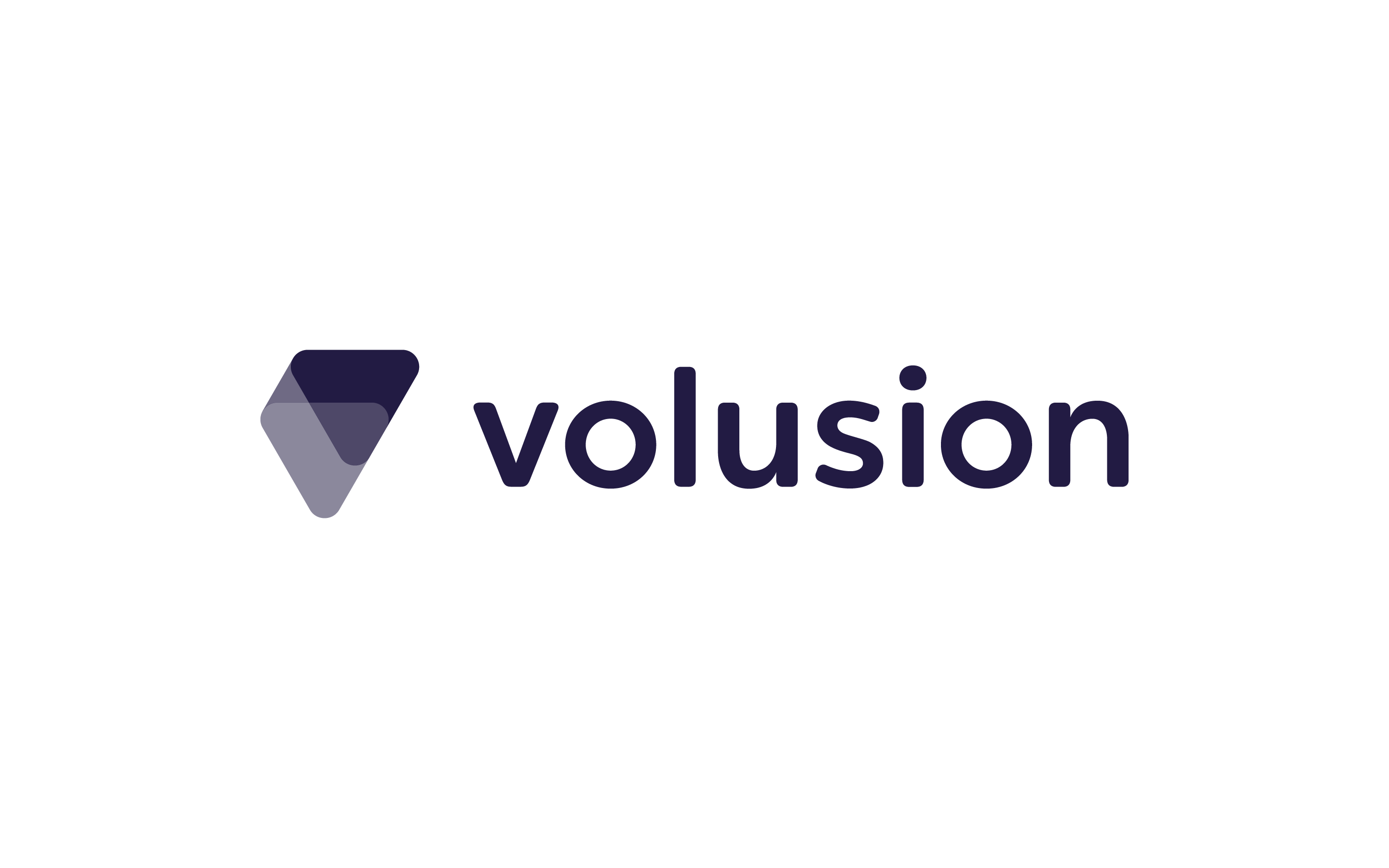
Logos
Below are the guidelines and parameters for the Volusion logo and symbols. In keeping with our brand personality, our logo is bright and simple. These guidelines are put in place to ensure consistent legibility and recognition.
Minimum Size
Minimum size to preserve legibility in print and digital formats.
Logo Best Practices
Minimum size to preserve legibility in print and digital formats.
Don’t add dropshadows.
Don’t use the wordmark alone.
Don’t squeeze or strech the logo.
Don’t rotate the logo.
Don’t add a gradient to the logo.
Don’t use with logo contrast backgrounds.
Don’t change the color of the logo.
Don’t add to the logo.
Don’t use the logo on a busy background.
Primary Font
Volusion’s primary font is Galano Grotesque Alt, a versatile and legible font withvarious weights and styles. It can be downloaded for free on Google Fonts and Adobe Typekit.
Galano Grotesque Alt Bold
ABCDEFGHIJKLMNOPQRSTUVWXYZ
abcdefghijklmnopqrstuvwxyz
1234567890
‘?’“!”(%)[#]{@}/&<-+÷×=>®©$€£¥¢:;,.*
Galano Grotesque Alt Regular
ABCDEFGHIJKLMNOPQRSTUVWXYZ
abcdefghijklmnopqrstuvwxyz
1234567890
‘?’“!”(%)[#]{@}/&<-+÷×=>®©$€£¥¢:;,.*
Galano Grotesque Alt Semibold
ABCDEFGHIJKLMNOPQRSTUVWXYZ
abcdefghijklmnopqrstuvwxyz
1234567890
‘?’“!”(%)[#]{@}/&<-+÷×=>®©$€£¥¢:;,.*
Galano Grotesque Alt Light
ABCDEFGHIJKLMNOPQRSTUVWXYZ
abcdefghijklmnopqrstuvwxyz
1234567890
‘?’“!”(%)[#]{@}/&<-+÷×=>®©$€£¥¢:;,.*
Font sizes
H1 – The quick brown fox jumps over the lazy dog
52pt – Galano Grotesque Alt, Bold, Leading 56pt
H2 – The quick brown fox jumps over the lazy dog
42pt – Galano Grotesque Alt, Bold, Leading 52pt
H3 – The quick brown fox jumps over the lazy dog
38pt – Galano Grotesque Alt, Regular, Leading 46pt
H4 – The quick brown fox jumps over the lazy dog
24pt – Galano Grotesque Alt, Bold, Leading 26pt
H5 – The quick brown fox jumps over the lazy dog
18pt – Galano Grotesque Alt, Bold, Leading 20pt
H6 – The quick brown fox jumps over the lazy dog
16pt – Galano Grotesque Alt, Bold, Leading 17pt
Large Quote – The quick brown fox jumps over the lazy dog
24pt – Galano Grotesque Alt, Light Italic, Leading 34pt
Subhead – The quick brown fox jumps over the lazy dog
20pt – Galano Grotesque Alt, Regular, Leading 30pt
Body – The quick brown fox jumps over the lazy dog
16pt – Galano Grotesque Alt, Regular, Leading 26pt
Small Quote - The quick brown fox jumps over the lazy dog
18pt – Galano Grotesque Alt, Bold Italic, Leading 24pt
Link– The quick brown fox jumps over the lazy dog
16pt – Galano Grotesque Alt, Bold, Leading 26pt, #3BD2A2
Caption 1 – The quick brown fox jumps over the lazy dog
16pt – Galano Grotesque Alt, Bold, Leading 24pt, #3BD2A2
Caption 2 – The quick brown fox jumps over the lazy dog
14pt – Galano Grotesque Alt, Bold, Leading 22pt, #3BD2A2
Caption 3 – The quick brown fox jumps over the lazy dog
11pt – Galano Grotesque Alt, Regular, Leading 19pt, #3BD2A2
Primary Colors
Here are the primary colors of the Volusion brand. Each main color has a darkerand lighter shade.
Builder Blue
Design Purple
Ecommerce Cyan
Marketing Gold
People Pink
Success Green
Grayscale
Blue Grey
Grey
Rich Purple
CTAs/Buttons
Primary CTAs
Use the primary CTAs to demonstrate trial or store signups.
Large – 16pt text – Main CTA + Desktop
Secondary CTAs
Use secondary CTAs for non-signup options, such as “Learn More”
Button States
Different colors are used to show button states on the website.
#2196F3, 100% opacity
#42A5F5, 100% opacity
#1E88E5, 100% opacity
#8268FC, 100% opacity
#957FFC, 100% opacity
#7A60FC, 100% opacity
#4FD0E3, 100% opacity
#69D7E7, 100% opacity
#48CBE0, 100% opacity
#FFC53A, 100% opacity
#FFCE58, 100% opacity
#FFBF34, 100% opacity
#EB3569, 100% opacity
#EE5380, 100% opacity
#E93061, 100% opacity
#3BD2A2, 100% opacity
#58D9B0, 100% opacity
#35CD9A, 100% opacity
Iconography
The icons used on Volusion are chosen to create clear symbolic communication,humanize the brand and create development efficiencies when possible.
Use these color icons to show the main for site sections: Create, Sell, Grow and Help
Use these icons to communicate page sections, increase page flow and further humanizebrand concepts.
Use these icons to demonstrate user tasks (such as expand/collapse) and in thenavigation bar and footer.
Google IconsContent Introduction
Volusion has three primary brand goals for every piece of content we publish:
Focused on Your Success
Your business can be a success, and we’re here to help you at every stage of the entrepreneur journey. Do it yourself, or let your experts do it for you while you concentrate on your business
Trusted
We want to represent our products with concise and powerful language that shows the benefit of Volusion and inspires action from users.
Everything You Need
All-in-one. Adaptable to you. Seamless functionality. Made to scale.
Voice, Tone and Content
Voice: What Should We Write?
The voice of our brand is the voice of the founder. We’re founders too, and the voice of our content shows our ability to relate to business owners.
Here are some additional guidelines for our voice:
Trusted, but not boastful.
Humble, but not timid.
Helpful, but not pushy.
Succinct, but not simplistic.
Thought Leader, but not arrogant.
Informative, but not complicated.
Proud, but not showy.
Modern, but not trendy.
Approachable, but not emphatic.
Optimistic, but not overblown.
Clever, but not silly.
Tone: How Should We Sound?
Volusion usually has an informal tone, but it’s important to be clear and concise before being entertaining.
Here are some examples of how we want our voice to sound:
Create a Store Your Customers Will Love We want to be friendly and informative with our tone while still demonstrating the benefits of Volusion. Our product is about helping people succeed, and our focus is on our customers.
Sell with Ease We want to represent our product with concise and powerful language that demonstrates the strength of Volusion and inspires action from users.
My online sales have grown 2X year over year for the past two years with Volusion. We want to feature customer stories/testimonials when possible to show how real people interact with our product.
Content Best Practices
Content should be as concise as possible. Some pieces call for lengthy content, but for most posts it’s best to keep things short.
Here are some tips to keep in mind when writing:
Use Contractions Use contractions whenever possible. This keeps the brand voice informal.Example: “We’re here to help.”
Be Concise Focus on the who, what, when and where, and be sure to have a clear CTA.Example: “Sell with ease.”
Break up Bulky Paragraphs Use bullet points or white space to break up bulky paragraphs.
Use Graphics Make content pop with images, GIFs, photos and more.
Link to Pages Link to blog posts, other pages, support articles and more on Volusion.com
Focus on Customer Stories Use real-life stats and testimonials whenever possible. We love our customers!
Blog Post Guidelines
Our blog is the go-to resource for entrepreneurs. We want to provide business advice, lifehacks and inspirational stories of real people using our software.
Here are some tips to keep in mind when writing for the blog:
Include Customer Examples
Whenever possible, use real-life examples of customers using our product.Example: Write "How These 5 Merchants Sell on Amazon with Volusion," not "How to Sell on Amazon Using Volusion."
Focus on Customer Success
Show our customers and readers that we’re proud of our client success!
Link to Relevant Articles on Volusion
We have an extensive ecommerce knowledge base and on-site webinars, guides and more. These are great supplemental resources for posts and should be linked to whenever possible.
Show Expertise and Advice for Customers
Volusion is a one-stop platform for all entrepreneurs, and we're here with the resources they need to get started. We are experts in the ecommerce industry and we aim to do the work so our customers can focus on their business.
Imagery
Volusion’s imagery is authentic featuring real employees, customers and products shownin original spaces and real-life situations. No stock photogrpahy and no stereotypes.
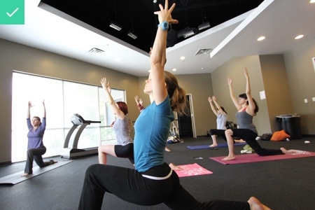
Do use imagery of real employees + events + office

Don't use cliche stock photos of office environments

Do show natural, candid imagery of customers and employees.

Don't feature staged or stock interactions or conversations.

Do show a variety of people (ethnicities, gender, etc).

Don't show people in unrealistic environments.
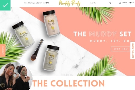
Do use imagery, stats and quotes from real-life customers.

Don't use stock imagery to demonstrate customer stories.
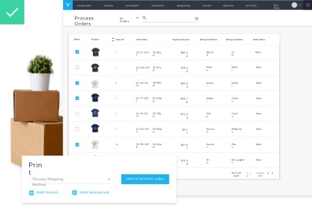
Do mix real-life objects with product views to tell our story.

Don't use outdated technology or overly staged shots.
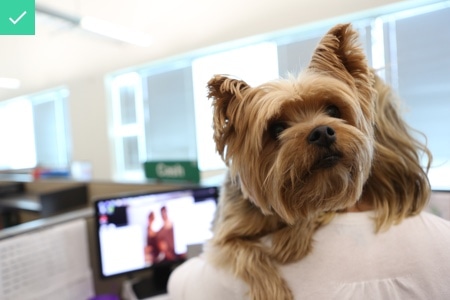
Do use imagery that shows our fun and friendly attitude.

Don't show overly sexualized/violent or drinking imagery.
Vocabulary Guide
- a
- A/B test
- ASAP
- b
- best-seller/best-selling
- beta
- business-to-business (or use B2B)
- c
- checkin (n.), check-in (adj.), check in (v.)
- clickthrough (n.), click through (v.)
- crowdsource, crowdsourcing
- d
- Dos/dont’s
- Dropshipping
- e
- e.g. (Abbreviation meaning for example)
- eBay
- ebook
- ecommerce
- estore
- everyday/every day info_outline
- f
- g
- h
- handheld
- handheld (n.), hand-held (adj.)
- hashtag
- homepage
- how-to
- i
- i.e.
- Inbound marketing
- internet (it is not capitalized!)
- IT (Abbreviation for “information technology.”)
- k
- keyword
- m
- mashup (n., adj.), mash up (v.)
- metadata
- n
- news feed
- news release
- non-essential
- not-for-profit/nonprofit
- o
- OK
- p
- page view/pageviews
- pay-per-click (or PPC)
- percent (not %; ex. 100 percent)
- plugin (n., adj.), plug in (v.)
- podcast
- q
- Q&A
- r
- retweet
- RSS
- s
- salesperson, salespeople
- screen capture
- screen name
- screenshot
- SEO
- setup (n., adj.), set up (v.)
- sidebar
- sign-in (n., adj.), sign in, sign in to (v.)
- sign-out (n., adj.), sign out, sign out of (v.)
- sign-up (n., adj.), sign up, sign up to (v.)
- site map
- slideshow
- smartphone
- startup (n., adj.), start up (v.)
- t
- touchscreen
- toward (not towards)
- Twitter/tweet
- u
- up-and-coming
- URL
- U.S.
- USA
- username
- v
- voicemail
- w
- webinar
- website
- whitepaper
- word-of-mouth
- y
- YouTube
Grammar Guide
- Commas
Use sparingly; try to break content up into separate sentences as often as possible. Use the AP Style comma — no comma between the second-to-last item and the and/or before the last item.
Correct: They sell gummy bears, cookies and Sriracha.
Incorrect: They sell gummy bears cookies and Sriracha. - Dates
Never put "st" "nd" or "th" following a numerical value.
Month + day = December 29
Month + year = December 2009
Month + day + year = Dec. 29 2009
Jan. Feb. March April May June July
Aug. Sept. Oct. Nov. Dec.. - Ellipsis
Never put a space following only three periods.
Correct: "Kale is so…whatever."
Incorrect: "Kale is so..whatever." "Kale is so...whatever." - Post Titles
Always use the title case. Keep titles simple: getting too creative can lose the meaning.
Correct: 15 Ways to Sell More
Incorrect: 15 Ways To Sell More, 15 ways to sell more - Italics
Applicable for book titles, album titles, movie titles, TV show names, series titles, blog names, publication titles.
- Quotations
Use only single quote marks around either a quote or movie/TV show/book/etc. titles. When ending a sentence with a quotation, include the punctuation inside the quotation marks.
Correct: Here are 5 sales lessons managers can learn from 'The Office.'
Incorrect: Here are 5 sales lessons managers can learn from "The Office".Double quotations go around song titles and articles inside the quotation marks.
Correct: The song “Achy Breaky Heart” was set to auto play on his homepage.
Incorrect: Jessica’s article “Sell Everything Ever” snagged record-high pageviews.
- Lists
Follow each bullet or number with your bolded point and follow each point with a colon. Don't add a period to the end of a point unless it is a complete sentence.
Correct: • Site design: Keep your design simple and clean.
Correct: 1. Site design: Keep your design simple and clean.
Incorrect: 1. Site design Simple and clean. - Dashes
Use an em dash (—) with a space on either side of the couple. You can type this dash by hitting option + shift + - on your keyboard.
Correct: We sold a lot of coal last season — about two times more than the year before — and we almost didn't have the resources to keep up with demand.
Incorrect: I always - and I mean always -- forget to use em dashes - Parenthesis
Keep punctuation inside only if it’s a complete sentence or an outlandish aside.
Correct: It's the easiest (and most important) way to connect with customers.
Correct: She listed the item. (It took her an hour because she got distracted by BuzzFeed, but that's besides the point.)
Correct: She felt so successful that she decided (of course!) to run for president. - Spaces
Don't do two in a row in between sentences. There needs to be only one. You actually never ever need to do double spaces for anything ever. No indentations, nothing.
- Time
If it refers to when a show airs, a contest ends, etc. distinguish if it is Eastern Time (ET) Central Time (CT) Mountain Time (MT) or Pacific Time (PT).
Correct: 3 PM, 3 AM
Correct: noon (12 PM) midnight (12 AM)
Incorrect: 3 p.m. 12 p.m
Get in Touch
To learn more about our brand or press opportunities, fill out the form below and we’ll be in touch!